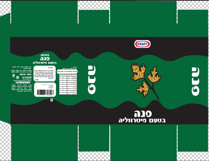
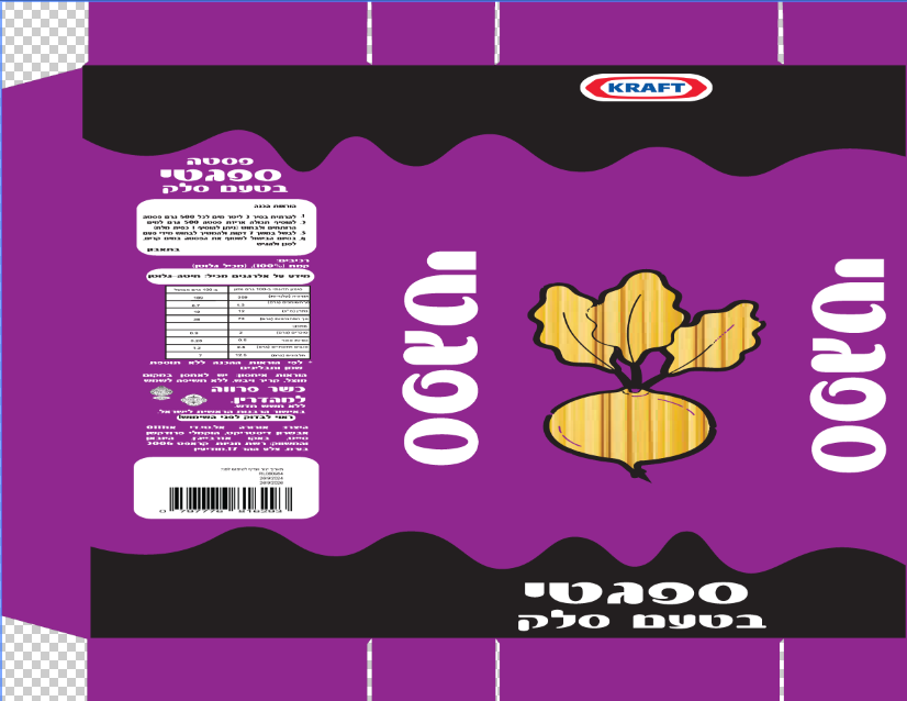
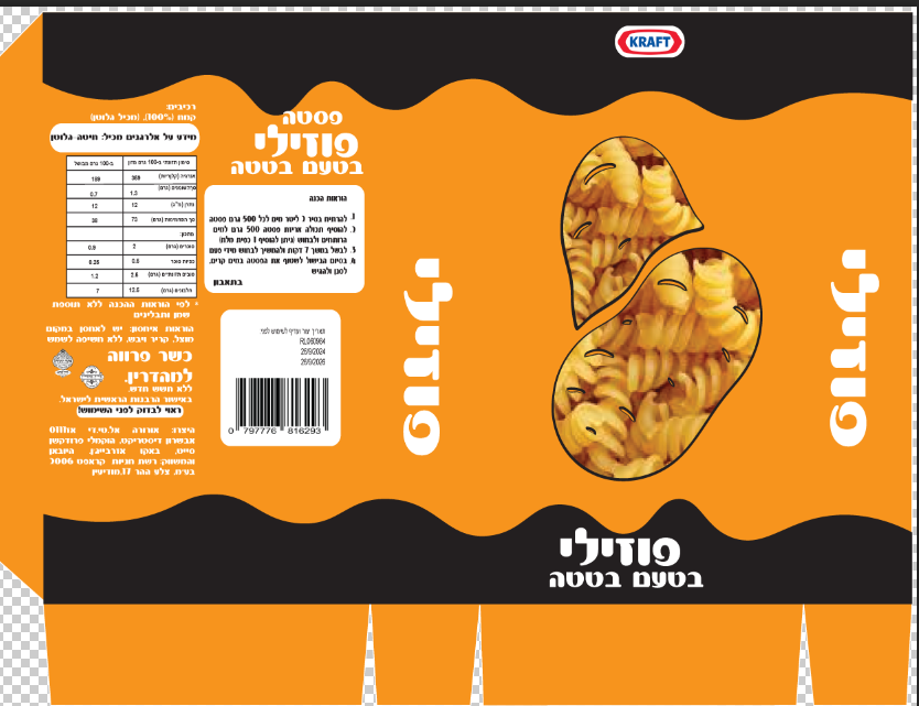
My design process for food packaging, inspired by the Kraft pasta examples, focuses on translating the product's flavor and pasta type into an appealing and informative visual. I select bold, legible typography and a vibrant color palette directly linked to the flavor for clear differentiation. The composition features high-quality imagery of the ingredients and pasta, ensuring immediate recognition. Attention to details like nutritional labels and textures creates packaging that is both visually striking and highly functional.